Ringpull Redesign
The aluminium cans are a unibody design with a riveted ring lever to ensure parts cannot go missing after consumption and the whole unit is recyclable. The design that has been implemented modifies the current design that is most commonly found on most aluminium beverage tops.
This modified design could be manufactured for little additional cost beyond the additional small surface area increase. This choice was made as people with either long or painted nails can struggle to open a can as it is flush to the top face. This design is slightly elevated, to just below the rim of the can ensuring the top won’t be accidentally opened in a bag if the top comes into contact with anything else and is wider to accommodate the width of the thumb.
Below is a video I took illustrating the issue with current ring pull design. This is based on a real use case whereby my partner showed me a method for opening a can with the side of her thumb. This applies quite a bit of pressure and renders the thumb a little sore. This design would help to alleviate this issue.
It is also interesting to note at this point that there are a significant number of products on Amazon to help with this problem, and the solution proposed within this design could be modified to make cans easier to open for people with physical ailments such as arthritis and weakness associated with old age.
Ultimately, without actually testing this in practice it may be impractical to incorporate the design in real life. There are complex physics attached to the fulcrum action of a ring pull and this is not something I am qualified to speculate upon. This choice is merely an exercise in attempting to improve upon a ubiquitous design.
Multipack Materials
The method that was chosen for containing a multipack is utilising an alternative to the traditional single-use plastic ring. It would use the basic shape and design concept of the sixer ring, but as an alternative to Polyethylene Terephthalate (PET). The ring system would use a molded pulp from recycled sources of cardboard and paper, similar to the materials used by McDonalds drink holders.
This solution has a threefold benefit.
1: It is easily manufacturable, while it is a custom design due to the uniformity of the product in question, we would only need to implement a single design solution for the entire product range as this would be used for all multi packs. This material is easily adaptable and could in theory work in any combination of two rows.
2: This material can be fed back into the recycling system with ease, helping to create and sustain a cycle of reduction. If for whatever reason, this product doesn’t make it to recycling, due to its material, it is easily biodegradable and will have significantly less impact on the environment in a worse case scenario than alternative materials.
3. There is a relative low cost to this approach as it uses far less material than a box, and as a business you could take advantage of economies of scale. If Audere as a brand were to succeed, it would become more viable to source these materials on a local level and avoid international shipping, further helping the green agenda Audere has.
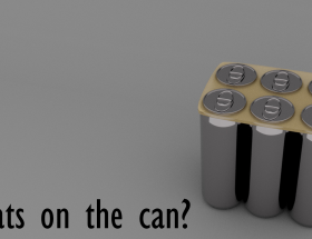
Can top – Braille
Atop each can is the name of each of the flavours in braille, pressed from within to the top prior to fixing. Once again, I cant imagine this would impact cost overwhelmingly, but it helps in the aims of making this product more widely accessible. For illustrative purposes, the braille on the cans has been colour coded so it is more easily seen for this product demonstration.
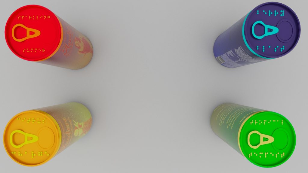
This design element was inspired by an article by Adam Teeter who goes on to write “In Japan, this problem is even more of an issue because it’s not just soda and beer that’s packaged in aluminum cans. Recognizing this, about 10 years ago Japanese brewers began stamping the word “beer” in Braille on the top of their cans, right next to the tab you’d pull to open it up and take a swig.” (Teeter, 2016).
Printing on the cans
Due to the limited colour pallet of each product, the cans would stand out on a shelf due to the tri-tone design of the cans. Using a reduced colour pallet for the artwork would make the whole product line cheaper as there is less variety in inks required and it would be possible to secure greater quantities of these inks, compared to a full range.
Branding of the product line
One of the core goals of Audere is to try and avoid the typical trappings of the energy drink market.
One of the key strengths of this brand is the representation that is upfront as soon as you see it. I tried to incorporate a range of women in the design elements to make it appear inviting towards women without the performative masculinity of the core five brands I explored in the first series of blog posts.
The language choices on the can are open and inviting, not overtly stressing the energy boost it contains but focused more on the natural elements of the product line and the holistic value.
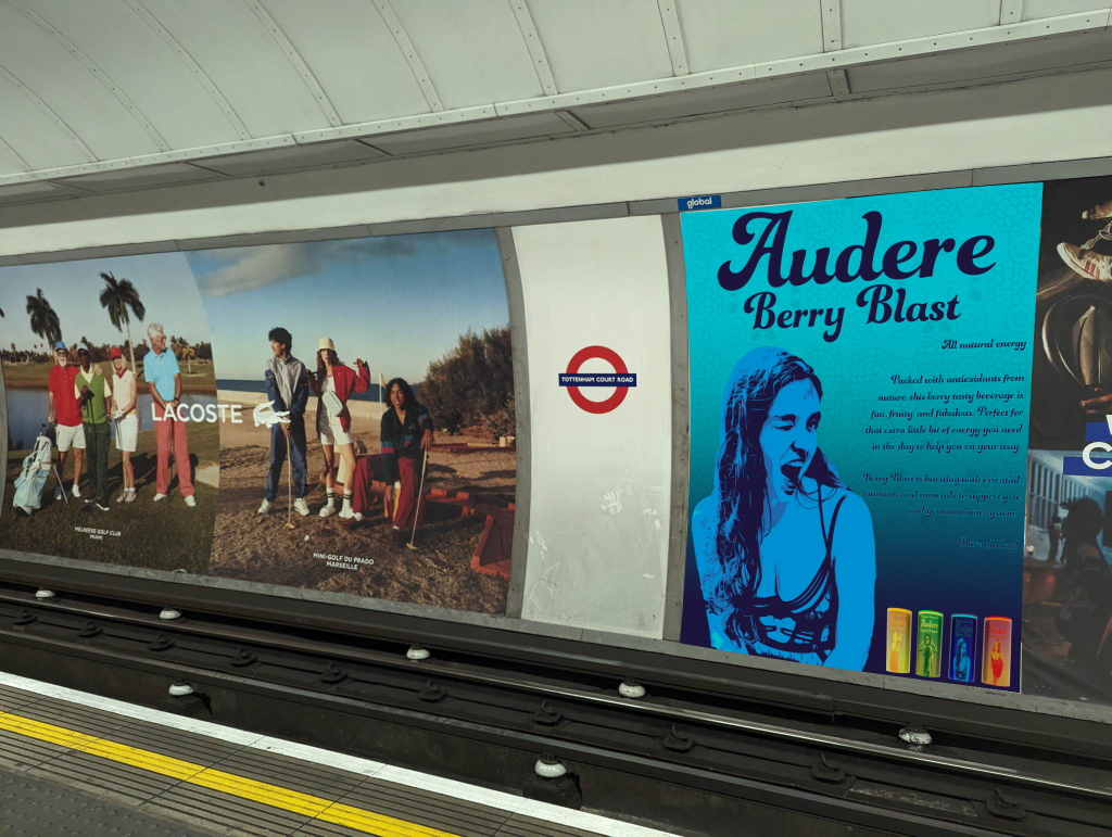
The main area Audere would be marketed in would be high foot traffic areas such as vending machines in areas such as tube stations, supermarkets and potentially health food stores.
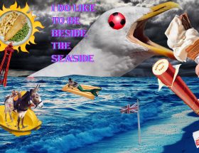
Below here is a poster designed to engage with the end user in an area that would have plenty of the target demographic.
This is an advertisement that could run on both television and online in the form of a pre roll through streaming services such as Youtube.
(The song used is by Marina called FROOT)
Bibliography
Marina (2015). FROOT [Recorded by M. Diamandis]. NYC, New York, USA.
Teeter, A. (2016) Braille labels in Japan help ensure no one gets accidentally intoxicated, VinePair. Available at: https://vinepair.com/articles/braille-labels-in-japan-help-ensure-no-one-gets-accidentally-intoxicated/ (Accessed: 02 May 2023).