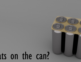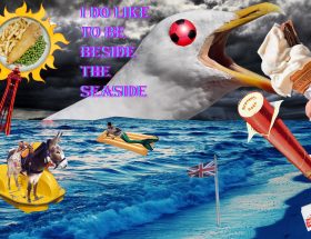
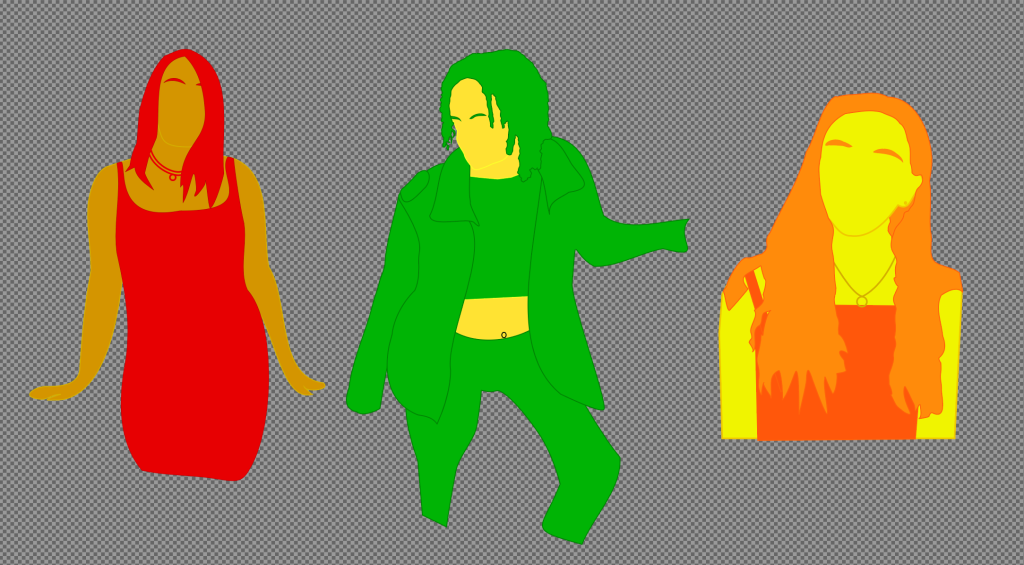
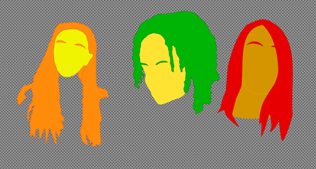
The initial designs I created using vector artwork in Adobe Illustrator were unable to convey the life I wanted in the brand. The images below show three of the potential “flavours” and these images were too flat. The brand needed a uniform design and during this stage of development and multiple attempts I was unable to get them in line with my expectations.
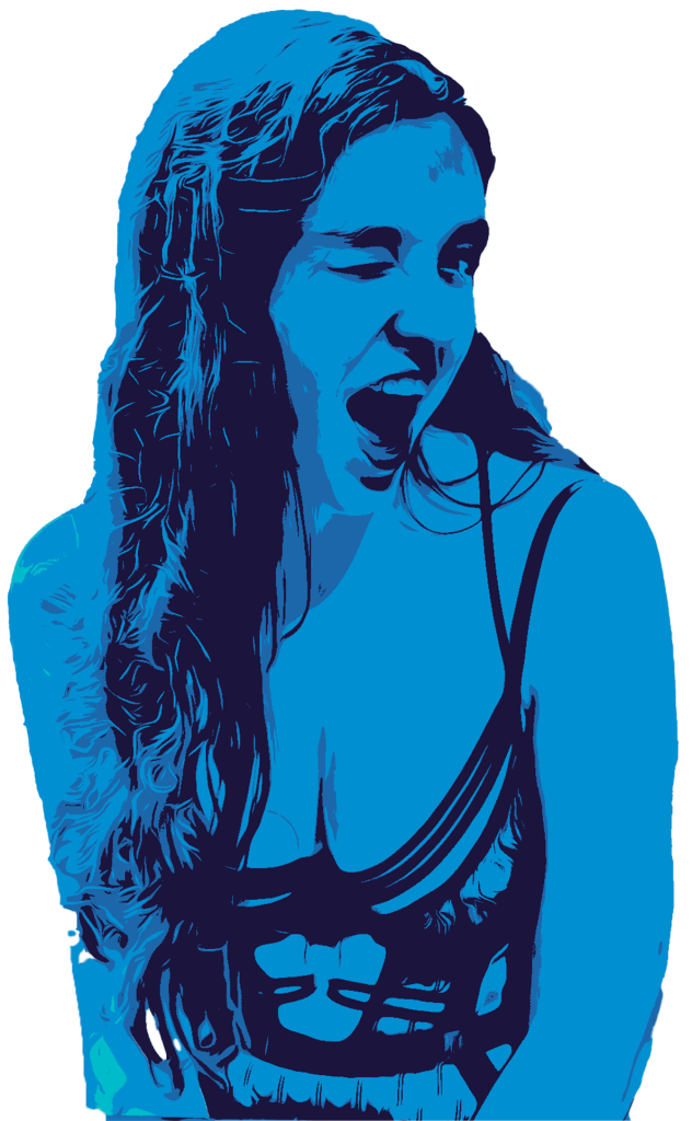
This led to a period of experimentation in photoshop applying a multitude of adjustment layers to the models I had selected. Each character utilises a tri-tone colour scheme to ensure each has a unique aesthetic applied to them.
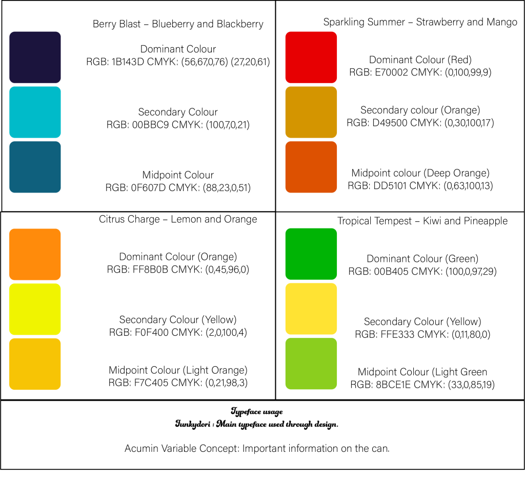
It was during this stage that the brand style guide was developed. This document was referred back to constantly throughout the rest of the development process and was key to creating a unified aesthetic throughout.
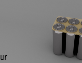
The images below show the evolution from the vector concept towards its final form.
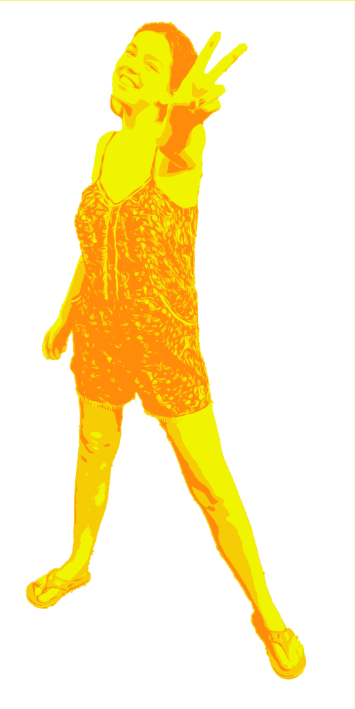
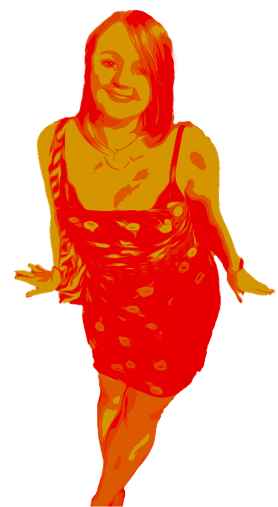
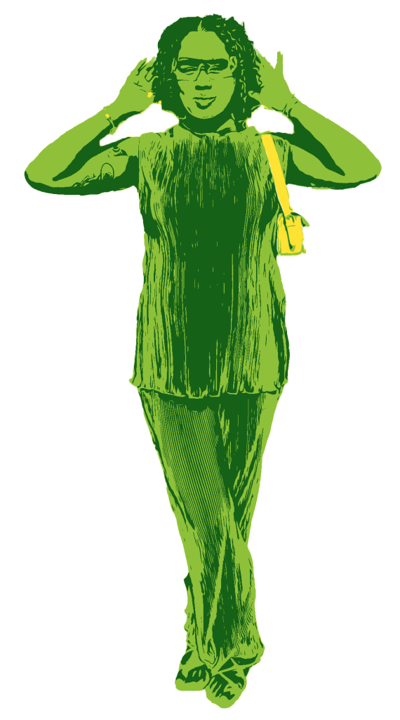
Each of these “characters” feel unique in their pose and fit the template for the can design that came later. This development stage was pivotal as it guided the general feel of the brand and helped the rest to fall into place.
Bibliography
Jaymie Darrel Photo 2023. Photo. [Online]
[Accessed 02 05 2023].