Name and Tyepfaces
As the main illustrations had been created, next the logo needed designing. The initial idea (prior to the vector artwork and subsequent development) was to create a name for the brand and choose a typeface.
The first revisions of this period were quite a struggle as a lot of names had already been taken in this space.
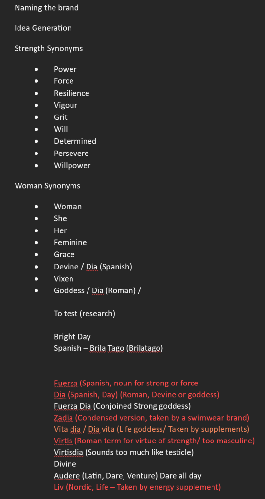
None of these resonated with what the idea of the brand was in my head, and I eventually settled on Audere. Audere is a latin term that means to dare or act boldly. Its most famous usage is in the Tottenham Hotspur football team’s slogan “Audere est facere” which translates to “To do is to dare”.
This word became stuck in my head throughout development and I kept coming back to it. Audere, is a pleasant word to say and nicely fit into the slogan “Audere, dare all day!”. As this brand is trying to buck the conventions set by the predominant brands in the energy drink space, this word isn’t overly aggressive like some of the potential names I had tested, and as it is six letters, it has a natural centre point.
One of the early ideas for the name was to base the design around fashion magazines such as Vogue, as the name Audere has a similar “otherness” to it.
As the artwork came together, I settled on the typeface Funkydori. This typeface in conjunction with the artwork created a playful and feminine aesthetic that helped to show what the brand is all about with little other information.

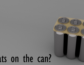
Pattern creation for the cans
For the wrap around design of the cans, I experimented with geometrical vector designs. This approach started with simple triangular shapes tessellated in a grid. This approach is aesthetically pleasing however it doesn’t match the rest of the design elements and as such it was back to the drawing board, so to speak.
Thematically, the designs of the cans had a reliance on the tri-tone artwork which appears quite simple. Using the tessellation approach as inspiration, I developed shapes to signify the flavours each can contains. Some of the designs are more intricate than the others such as the “Berry Blast” which uses a simple top perspective view of a blueberry and a front faced stylised blackberry.
This was the prototyping stage for the can aesthetics and as such “Berry Blast” has the most iterations of this pattern style design to try and use this as a template for the subsequent flavours.
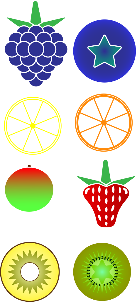
All of the shapes used had three rules to abide by
- Be easily identifiable based on their shapes in case a consumer doesn’t have English comprehension skills and as such may rely upon image recognition to inform their purchasing choices.
- They must be mirror images of themselves for the sake of tessellation and grid conformity.
- Not rely upon colour and only use the stroke weight without fill in Illustrator.
The first few drafts didn’t go particularly well, as I tried to weight the pieces and avoid negative space. When the following designs were implemented into a template, they muddied the visual coherency and made the text on the can less legible and lacked clarity and definition.
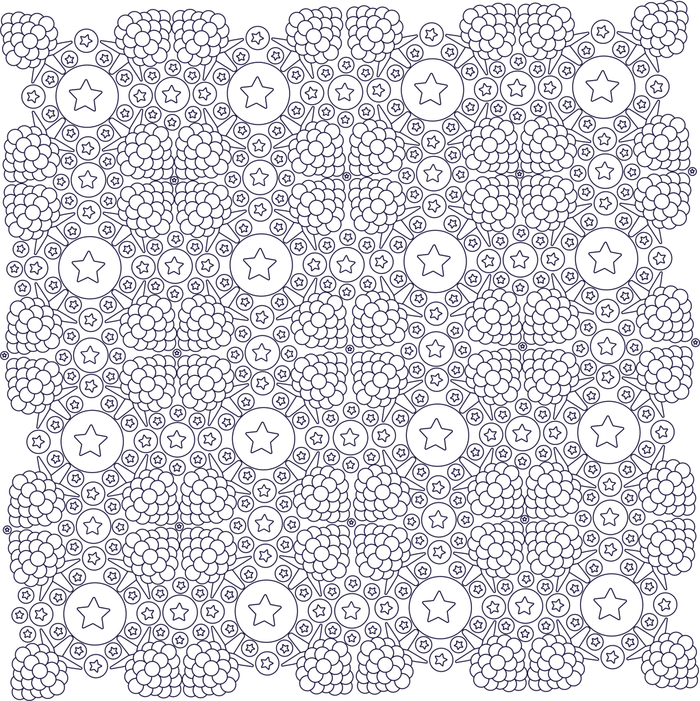
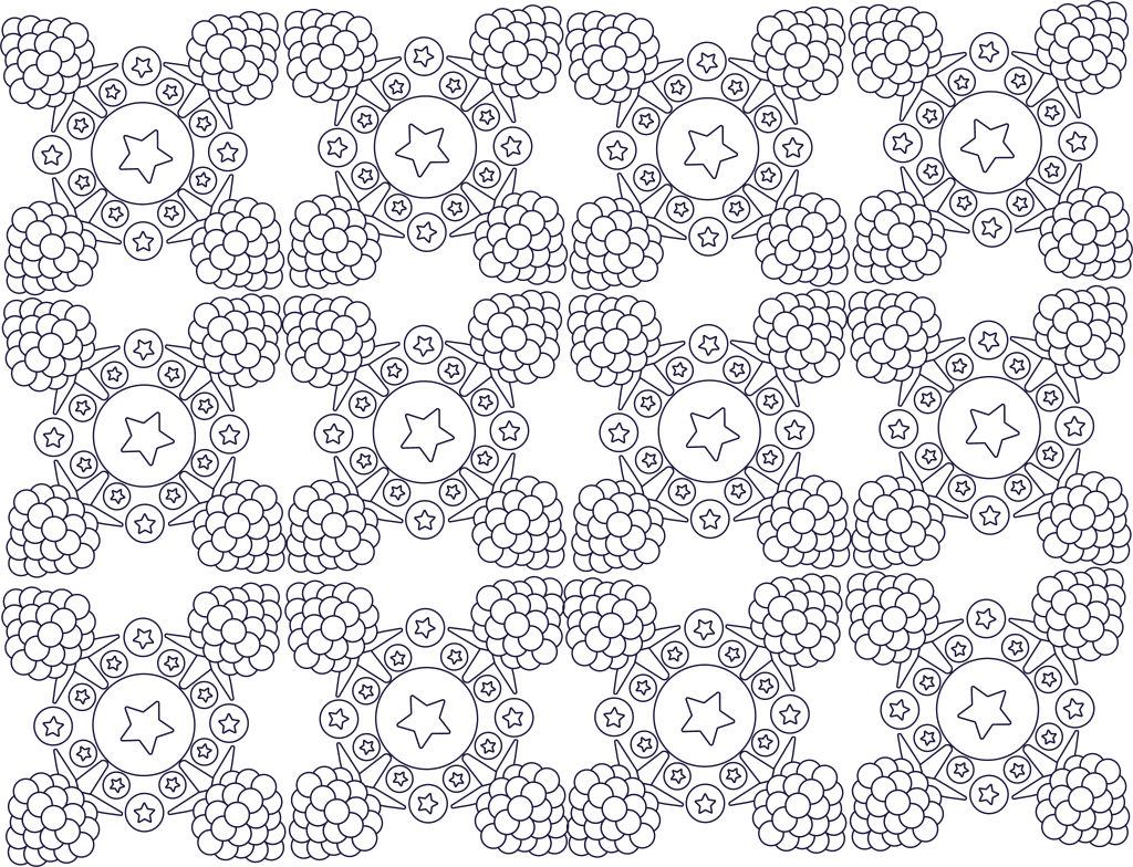
Final versions of background artwork
By creating a square block to place the artwork into, it became easier to tessellate the shapes and create the easily identifiable fruits. This had the added bonus of allowing a resizable square that would overlap at the seam when the 3D models of the cans were UV unwrapped. This helps to blend the whole thing together to create a cohesive label without a solid colour strip making it quite so obvious. These designs use Tufte’s principle of Micro Macrocosm to show the individual elements of the fruits and how they can combine to create something beautiful.


In the next post we will explore how these separate elements were placed together to create each can.