Major Project submission – 003- Practical work Script
The core focus of this project was to create a brand with a heavy emphasis on colour choice and curating its usage and tying it together in a holistic package that is different to the rest of the energy drink industry.
Audere is an energy drink brand that was created with the sole intention of avoiding the typically overtly masculine branding that comes with this market space.
In the first set of blog posts, I examined how these five key brands market themselves in the modern day.
- Red Bull
- Monster Energy
- Rockstar Energy
- Prime
And
- Reign
Through this research I saw how these five brands monopolised the space with hegemonic masculine tropes, tying themselves to the video game industry, extreme sports and power lifting.
After careful examination of these brands, it was important to see how other products within the beverage industry have tried to combat the ever present threat of climate change. Some brands heavily influenced my design such as Keelclip, Keelclip reduces the amount of plastic and carboard used in the manufacturing process by creating a compact container that is manufactured through paperboard.
The Carlsberg Group adapted in a different manner implementing a design they call snap pack. Snap packs use a small amount of glue to hold several beverages together and reduce the plastic usage by an impressive 76%.
Finally in the research phase I looked at the core five brands alongside a few notable exceptions outside of the beverage industry to see how colour was utilised as part of the brand and product identities.
The second series of blogposts helped narrow down the demographics I want to target with my brand and how women are typically perceived in advertising. As you might expect, it isn’t overwhelmingly positive.
Based upon this research, I set out to make my brand appeal to women in the 18-35 category that would be interested in energy drinks, but may be put off by the current offerings of the industry.
The first piece of creative work I made was a vector illustration of my partner, this was an experimentation to see how this art style may help to lead the brand. From here I created several more vector based pieces but I felt this stylistic choice was too limiting and would force the brand down a specific route, that I felt I was unable to properly deliver on.
One of the key developments that took shape during this stage was the creation of the brand style guide. I was adamant that I wanted to use a tri-tone art style, as this would help to differentiate the products on the shelf.
After researching alternatives to vector based artwork, the best path forward was to create artwork based upon photographs I had taken (with the exception of one) with heavy modification in photoshop relying upon the tri-tone colour pallet and some modifications to make the colours band together to achieve the desired effect.
The four characters that follow are at the core of Audere as a brand. It shows Women thriving, with a somewhat diverse range of avatars. It is hoped, that if this product was on the shelf, women may see themselves in these characters and would hopefully feel empowered to purchase.
It was difficult to land on the name Audere, the initial ideas were pretty fruitless as there are a million and one energy drink brands on the market already, and to be honest most of the good names have already gone.
After a suggestion from Rob to look at fashion magazines for a point of inspiration, I settled on the name Audere. This word became stuck in my head throughout development and I kept coming back to it. Audere, is quite a pleasant word to say and it nicely fits into the slogan “Audere – Dare all Day!.”
As this brand is trying to buck the conventions set by the predominant brands, Audere isn’t overly aggressive like some of the potential names I had considered, and it is nicely weighted to have an obvious midpoint at only six letters.
Once the name and typeface had been selected, I started to work on the illustrations that would be present behind everything on the can to give it some visual appeal. The first few drafts of this wasn’t quite what I was looking for, for example the illustrations on screen while aesthetically pleasing didn’t fit the vibe of the brand.
It eventually felt obvious to vectorise the fruit that was present in each flavour and I used Berry Burst as my experimentation ground. I created a set of three rules for these illustrations.
- Be easily identifiable based on their shapes in case a consumer doesn’t have English comprehension skills and as such may rely upon image recognition to inform their purchasing choices.
- They must be mirror images of themselves for the sake of tessellation and grid conformity.
- Not rely upon colour and only use the stroke weight without fill in Illustrator.
These images show the first “true” version of the background idea, but they didn’t have enough negative space and made the text on the cans less clear and muddied the definition somewhat.
These are the final versions of the four flavour backgrounds. Each was created in a block to ensure tessellation and tiling was possible when the UV’s for the cans were unwrapped and a net was added to photoshop.
BRINGING IT ALL TOGETHER
With these separate design elements created, I used the net taken from the can model to create a design template, allowing for simple swapping in and out of each design with relative speed and accuracy.
On screen is each can rotating through, showing the full face of each design. The design was tiled in such a way to make the seem disappear and allow for a flowing and congruent design aesthetic.
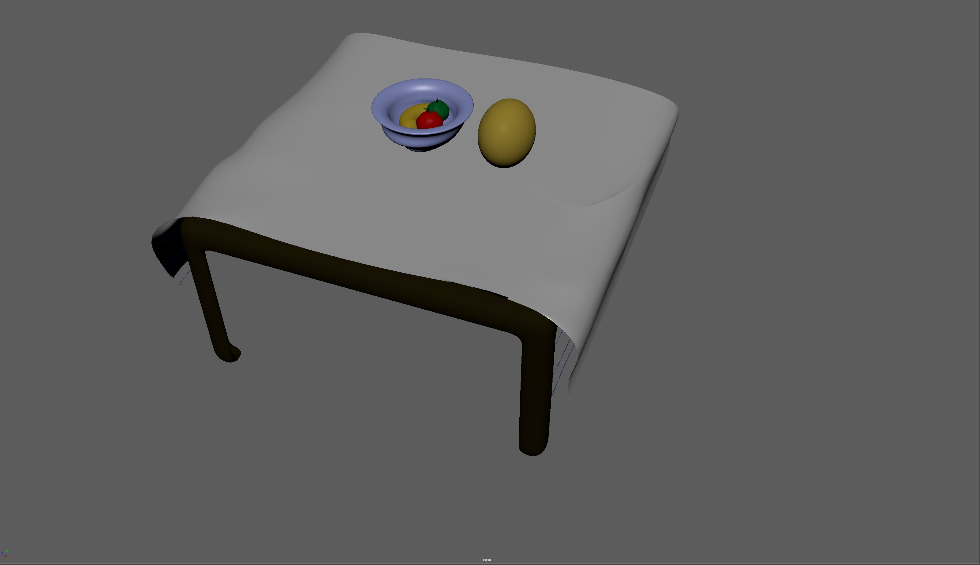
It is important to note, that the render quality could be higher but due to the time limitations this is the highest render quality I could achieve with the given time.
Top of the Can
The design that has been implemented modifies the current design that is most commonly found on most aluminium beverage tops.
This modified design could be manufactured for little additional cost beyond the additional small surface area increase. This choice was made as people with either long or painted nails can struggle to open a can as it is flush to the top face. This design is slightly elevated, to just below the rim of the can ensuring the top won’t be accidentally opened in a bag if the top comes into contact with anything else and is wider to accommodate the width of the thumb.
This is a video I took illustrating the issue with current ring pull design. This is based on a real use case whereby my partner showed me a method for opening a can with the side of her thumb. This applies quite a bit of pressure and renders the thumb a little sore. This design would help to alleviate this issue. This design could be implemented on other products to allow ease of access for those afflicted by arthritis or general weakness.
Ultimately without actually testing this in practice it may be impractical to incorporate the design in real life. There are complex physics attached to the fulcrum action of a ring pull and this is not something I am qualified to speculate upon. This choice is merely an exercise in attempting to improve upon a ubiquitous design.
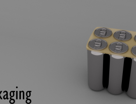
MULTIPACK
The method that was chosen for containing a multipack is utilising an alternative to the traditional single-use plastic ring. It would use the basic shape and design concept of the sixer ring, but as an alternative to Polyethylene Terephthalate (PET). The ring system would use a molded pulp from recycled sources of cardboard and paper similar to the materials used by McDonalds drink holders.
This solution has a threefold benefit.
It is easily manufacturable, while it is a custom design due to the uniformity of the product in question, we would only need to implement a single design solution for the entire product range as this would be used for all multi packs.
This material can be fed back into the recycling system with ease, helping to create and sustain a cycle of reduction. If for whatever reason, this product doesn’t make it to recycling, due to its material, it is easily biodegradable and will have significantly less impact on the environment in a worse case scenario than alternative materials.
There is a relative low cost to this approach as it uses far less fresh material than a box, and as a business you could take advantage of economies of scale. If Audere as a brand were to succeed, it would become more viable to source these materials on a local level and avoid international shipping, further helping the green agenda Audere has.
CAN TOP
Atop each can is the name of each of the flavour is pressed from within in braille to the top prior to fixing. Once again, I cant imagine this would impact cost overwhelmingly, but it helps in the aims of making this product more widely accessible. For illustrative purposes, the braille on the cans has been colour coded so it is more easily seen for this product demonstration.
References
(Reuters Plus, 2018)
(Keelklip, 2021)
Bibliography
Action Aid. (2023, 05` 01). Period Poverty. Retrieved from Action Aid: https://www.actionaid.org.uk/our-work/womens-rights/period-poverty
Keelklip. (2021, 05 27). Keelclip. Retrieved from Keelclip: https://www.youtube.com/watch?v=jywmd5H70Q0
Marina (2015). FROOT [Recorded by M. Diamandis]. NYC, Ney York, USA.
Reuters Plus. (2018, 11 7). Carlsberg Launches first “Snap pack” to fight plastic waste. Retrieved from Youtube: https://www.youtube.com/watch?v=NY0ikbi7Pa4
Teeter, A. (2023, 05 02). Braille Labels In Japan Help Ensure No One Gets Accidentally Intoxicated. Retrieved from Vinepair: In Japan, this problem is even more of an issue because it’s not just soda and beer that’s packaged in aluminum cans. Recognizing this, about 10 years ago Japanese brewers began stamping the word “beer” in Braille on the top of their cans, right next to t