To help create the brand identity and a strong visual identity I am using photographs of women that are in the target demographic (with permission) to convert into vectorised forms.
These images utilise colour that strongly derive from the flavour profile of the product. The four launch flavours I have decided the product line would be are blueberry and blackberry; strawberry and mango; lemon and orange; and kiwi and pineapple. The two dominant flavours dictate the colour scheme of the product to help alleviate muddled colours and create a consistent and recognisable line.
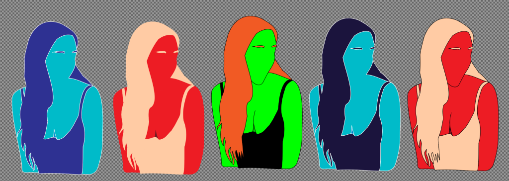
The background of each can will use a lighter shade of each colour used with pattern designs that alternate the dominant colour, so the image isn’t lost against it. Each colour used will have the RGB and CMYK values listed to ensure consistency between product and visual representation either digitally or printed.
This stage is early in development and I will experiment further with adding shapes but the first experiments rendered my model looking like a monster due to the wink not been conveyed and appearing as if spiders were emerging from the socket.
Berry Blast (Blueberry and Blackberry)

Berry Blast colours used
Hair, dress and eyebrows
RGB: 1b143d
CMYK 0.56 0.67 0.00 0.76
Skin
RGB 00bbc9
CMYK 1.00 0.07 0.00 0.21
Skin shadow
RGB 0083c9
CMYK 1.00 0.35 0.00 0.21
- Sparkling Summer (Strawberry and Mango)
- Citrus Charge (Lemon and Orange)
- Tropical Tempest (Kiwi and Pineapple)