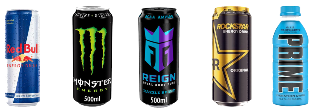
For the Major Project module,this blog will examine the current state of the energy drinks market and curate this research into developing a new brand and its identity. There are five brands that have been selected for examination throughout this research phase due to their prominence in the UK and what differences make them unique from each another. For the early stages of development, I will dedicate the first four areas of research into the following topics: Language, demographics, packaging and colour.
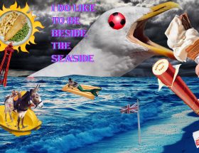
I personally find energy drinks fascinating as their packaging must convey more of an idea than the actual product itself. The five brands have all successfully cultivated a unique identity within this space and this research will help me understand how to create my own.
What’s on the can? An exploration of language and iconography
All brands that are prominent regardless of the industry they are in use logos, icons and text. How have energy drink manufacturers utilised the small canvas a single can presents to convey why you should pick their product above a competitor?
Demographics of energy drink consumption and associated advertising
It is typical for energy drinks to try and engross themselves into the lives of young people, regardless of the potential health issues that these drinks may present. It is important to understand what the core demographics of these products are and how the government has tried to intervene. This is a holistic approach that will also examine some of the advertising techniques used to try and cross promote between products. This will help me to avoid the same trappings the established brands are guilty of.
As a society we are seeing the effects of climate change and pollution seep into our everyday lives more than ever. How have brands within the consumable drinks market adapted to these conditions and attempted to make positive changes and could this research help me to develop a new method to reduce the amount of wastage?
Colour Usage in Brand Awareness
Colour is one of the most powerful tools available to creators as humans have an inherent understanding of colour and “for better or worse, it affects the moods of and elicits reactions from clients and consumers alike” (Miroka & Stone, 2006). This research will examine how the five brands in this space have utilized colour to consistently maintain an image.
These ideas are going to help me create a brand and supplementary materials combining animation, vfx, vector artwork, logo design, colour theory and more.
This section of the blog will detail the plan for work beyond this initial submission.
Bibliography
Miroka, A. & Stone, T., 2006. Color Design Workbook. In: Massachusetts: Rockport, p. Blurb.
Image sources
Monster Energy, 2022. The Original Green Monster Energy. [Online]
Available at: https://www.monsterenergy.com/gb/en/products/monster-energy
[Accessed 08 12 2022].
Prime, 2022. Prime collections – All. [Online]
Available at: https://drinkprime.uk/collections/all
[Accessed 12 12 2022].
Red Bull, 2022. Red Bull [Online]
Available at: https://www.redbull.com/gb-en/
[Accessed 12 12 2022]
Reign Energy, 2022. The taste of Reign – The core flavours. [Online]
Available at: https://reignbodyfuel.com/en-gb/products/
[Accessed 12 12 2022]
Rockstar Energy, 2022. Rockstar – Energy Drink. [Online]
Available at: https://www.rockstarenergy.co.uk/
[Accessed 12 12 2022].