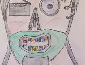
This is a work in progress
The above drawings are an experiment to see how I could convey film making
iconography. My mind immediately went towards classic film projection as it
synonymous with the topic.
I started with a simple projector shape with the intention of using this as
the base of my design. However, it felt as if this would be too cluttered with
the complexity of the shape and would lose its identity with the Hi/Lo text on
it.
To attempt to remedy this I opted to
focus on the film reel itself. This offers multiple benefits as this would
allow for me to integrate the shape itself into the rest of the logo and incorporate
the Omega symbol as discussed in a prior blogpost. Film reels are synonymous
with cinema and while they may have become a redundant technology in modern
times, the film reel is a strong visual indicator as to the intention of my
campaign. I cannot think of a symbol that would resonate as strongly with cinema
as a film reel.
To create this shape in Illustrator I added a basic vector image of an Omega
symbol and scaled it up to the correct size. I then added a large circle in the
centre with several white spaces to create the projector holes. I had considered
trying to make the Omega symbol thinner and tapering off both ends to try and
make it more closely resemble a film strip but found this approach muddied the
clarity of the design.
Colours used in the logo
Red = Pantone 485C
Blue = Pantone 2727C
Purple = Pantone Violet C