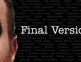
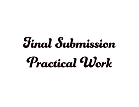
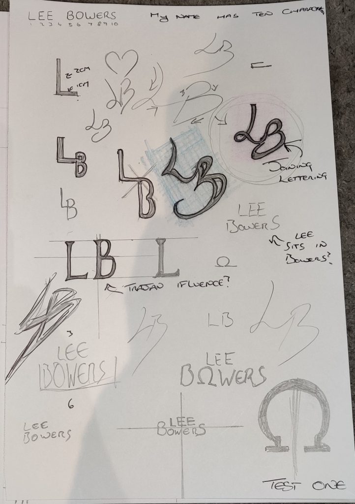
This is the process i utilised to create my logo. This is not a finalised version but a work in progress so far.
The influence I cited in my previous work was Clerks, a movie from Kevin Smith. This film had a logo that was based on a variety of items that would be available in a convenience store. This would not work for what i am trying to achieve. However, each chapter of the film utilised the font “American Typewriter”.
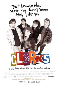
Original poster Clerks 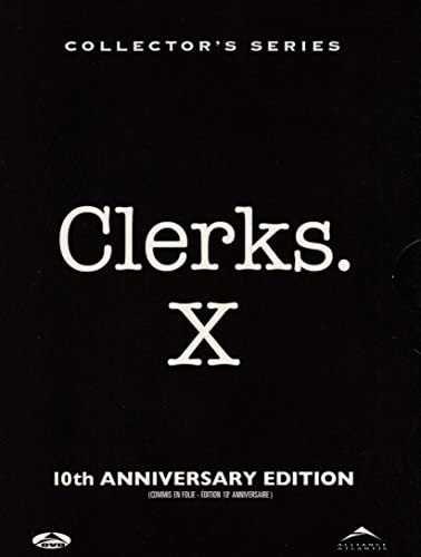
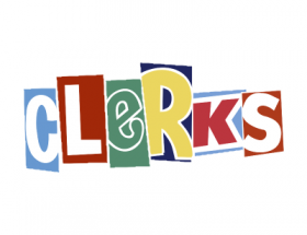
Revised logo for tenth anniversary (American Typewriter)
By using Adobe Illustrator I tried a variety of approaches to see how my potential logo would sit.
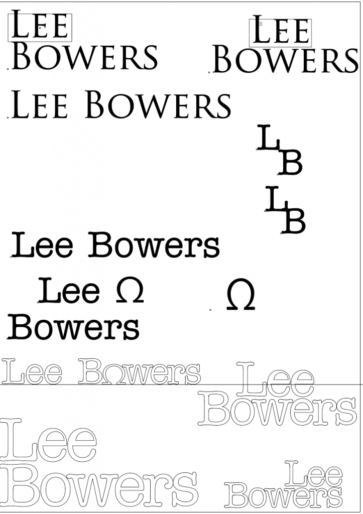
I was initially drawn to using Trajan as I felt it reflected aspects of myself to integrate into the logo. I soon realised however that it was lifeless and offered little flexibility for modification. This caused me to loop back towards Clerks and I began experimenting with both fonts to see what worked with regards to placement.
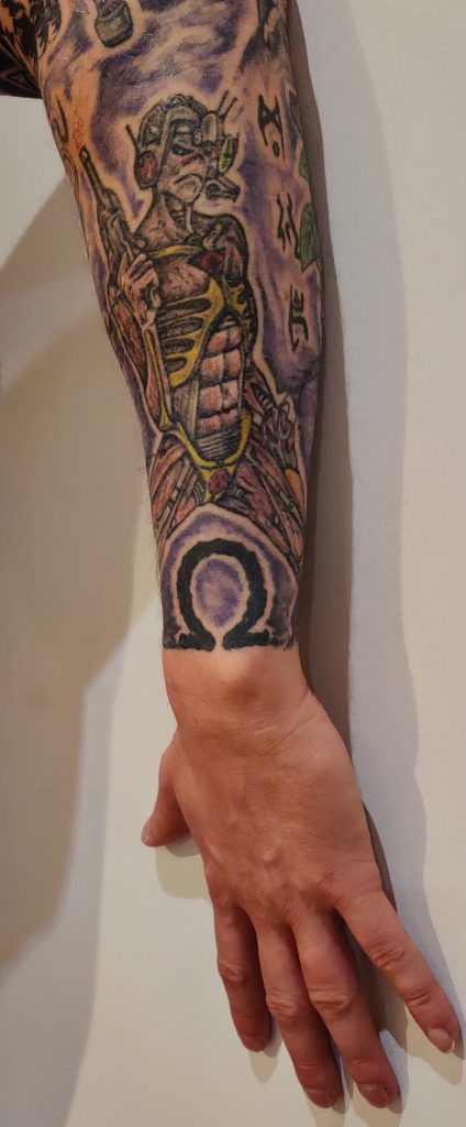
Finally, to add a more personal touch to the logo I added an Omega symbol in place of the O in Bowers. Omega is the final letter of the Greek alphabet and has strong connotations regarding finality and the end of something. Plus it’s something I have tattooed on my lower arm as it was used as the symbol for one of my favourite albums of time.
This logo needs additional work. While I used the Omega symbol glyph based on the font it doesn’t sit well with the other letters and will need modifying in the future.
References
IMDb. 2020. Clerks (1994) – Imdb. [online] Available at: <https://www.imdb.com/title/tt0109445/> [Accessed 17 November 2020].
Amazon.co.uk. 2020. [online] Available at: <https://www.amazon.co.uk/Clerks-10th-Anniversary-Collectors-Widescreen/dp/B0002J9YR4> [Accessed 17 November 2020].